Open almost any chat marketing or support platform and you will find a polished flow builder, a slick analytics page, and then — tucked behind a tab — the inbox. The place where a human being actually reads a customer's message and types a reply. The modern chat inbox UX, the part that does the real work of a conversation, is usually the most neglected screen in the entire product. It looks like it was designed in 2015 and never touched again.
That is not an accident. Most of these tools grew up as automation engines. The founders cared about drag-and-drop flows, keyword triggers, and broadcast sends, because that is what demoed well and what early customers asked for. The inbox was something you added later, when people complained that automation could not handle everything and a person needed to step in. So it got bolted on: a list of conversations, a text box, a send button, and not much else.
This piece is an opinion, and we should say so plainly. We build KlyoChat, an AI-native chat platform, and we built it because we were frustrated with exactly this gap. So we have a point of view and a product in the market. But the argument here is not a pitch. It is a set of design principles about what a chat inbox should feel like in this decade, why the dominant tools fall short, and what an honest, modern version looks like. You can apply these ideas no matter which tool you end up choosing.
What does it actually mean for an inbox to feel dated?
When we say an inbox feels like 2015, we are not talking about rounded corners or the current color trend. A coat of paint does not fix the problem. We mean the model underneath it — the assumptions about who uses it, how many of them there are, what device they are on, and what the software does to help.
A dated inbox assumes one person, at one desk, handling one conversation at a time, with no machine assistance and no record of what happened before. Every assumption in that sentence is wrong for how teams work now. Support is a team sport. Sales DMs come in on a phone at 9pm. The same customer talks to three different people across two weeks. And AI can draft a good first reply faster than a human can read the question.
So the test for whether an inbox feels modern is not visual. It is behavioral. Can two people work the same queue without stepping on each other? Can you hand a conversation to a teammate with context attached? Can you deal with a message now and have the system remind you to follow up later? Can you do all of that from your phone? If the honest answer is no, the inbox is dated, no matter how clean the typography looks.
Dated is a model problem, not a paint problem
You can redesign a flow-builder-first inbox a dozen times and it will still feel dated, because the limitation is the assumption underneath: one person, one desk, no machine help, no memory. Modern is about the model, not the gradient.
Why do so many chat tools ship a thin inbox in the first place?
The honest answer is incentives and history. The category was defined by automation. The first wave of chat marketing tools sold a promise: build a flow once and let it run while you sleep. That promise is real and valuable, and it is what got these companies their first ten thousand customers. The inbox was not the headline. It was the safety net for when automation could not cope.
When a feature is a safety net rather than the main event, it gets safety-net engineering. It is the screen that receives the leftover roadmap budget. Product managers do not lie awake thinking about how to make the reply box delightful, because the reply box is not what the sales deck is about. So the inbox accumulates the minimum: show the messages, let me type, let me send. Anything beyond that — team routing, snoozing, notes, AI — competes with the next flagship flow-builder feature and usually loses.
There is also a measurement trap. Automation produces clean numbers: flows triggered, messages sent, conversion rates. Inbox quality is harder to put on a dashboard. How do you measure the relief of handing a thread to the right teammate with one tap, or the saved minute of an AI draft that was actually correct? Because it is hard to measure, it is easy to underinvest in. The result is an entire category where the most-used human screen is the least-loved one.
Two ways to think about the inbox
- Flow-builder mindset
- The inbox is a fallback for when automation fails — give it the minimum
- Inbox-first mindset
- The inbox is where the relationship happens — design the rest of the product around it
Is the problem the flow builder, or the inbox bolted onto it?
To be fair to these tools: the flow builder is often genuinely good. Drag-and-drop automation, keyword triggers, comment-to-DM funnels — many platforms do this well, and we are not here to pretend otherwise. The problem is not that flow builders exist. The problem is the architecture that treats the flow builder as the product and the inbox as an accessory.
When the inbox is an accessory, it inherits the flow builder's worldview. Conversations are things that flows manage, and the human inbox is where flows hand off the ones they could not finish. That framing quietly shapes everything. Conversations are organized around automation status, not around people and ownership. There is no concept of a teammate, because a flow does not have teammates. There is no snooze, because a flow does not procrastinate. The data model never had a place for the human workflow, so the UI cannot expose one.
This is why surface-level redesigns of these inboxes rarely land. You can move buttons around, but you cannot add real team collaboration to a data model that was never built for teams. A genuinely modern chat inbox UX usually requires building the inbox as the center of the product and arranging automation around it — which is hard to retrofit and far easier to do from the start.
Ask vendors where the inbox sits in the architecture
During a demo, ask: was the inbox built first, or added to support the flow builder? You can often tell from the answer — and from whether team features like assign and notes feel native or bolted on.
What does a modern chat inbox actually need?
Strip away the marketing and a modern inbox comes down to a short list of capabilities that, together, turn a message list into a workspace. None of these are exotic. They have existed in email and ticketing tools for years. The strange thing is how rarely chat tools have them all.
Here is the core list, and what each one is actually for. Notice that most of them are about people working together, not about the machine doing tricks.
- Each capability is small on its own; the value is in having all of them together.
- Most are about coordination between humans, which is exactly what flow-first tools ignore.
- If a tool has three of these six, it is a message list. If it has all six, it is a workspace.
| Capability | What it does | Why it matters |
|---|---|---|
| Assign | Hand a conversation to a specific teammate | Clear ownership; nobody assumes someone else has it |
| Snooze | Hide a thread until a chosen time | Deal with it later without losing it or cluttering the queue |
| @mention | Pull a teammate into a thread by name | Get the right person without leaving the conversation |
| Internal notes | Private comments not visible to the customer | Context travels with the thread, not in a separate chat app |
| AI co-pilot | Draft, summarize, and suggest replies in place | Faster first response; humans edit instead of starting blank |
| Mobile parity | Full inbox on the phone, not a viewer | Replies happen wherever the person is, not only at a desk |
Why is assignment the feature that quietly changes everything?
Assignment sounds boring. It is the most important thing on the list. The moment two people share an inbox without assignment, you have a coordination problem disguised as a software problem. Two people reply to the same customer. A message sits for a day because everyone assumed someone else had it. A hard question gets answered three times, badly, by three people who each saw it fresh.
Assignment fixes this by making ownership explicit. A conversation belongs to someone. That person knows it is theirs; everyone else knows it is not. The queue stops being a free-for-all and becomes a set of clear responsibilities. This single change is the difference between a shared inbox that scales past two people and one that descends into chaos the moment you hire a third.
Good assignment is also low-friction. It should be one tap to take a conversation, one tap to hand it to a teammate, and the system should be smart about defaults — auto-assigning by channel, by topic, or round-robin so nobody has to babysit the queue. The goal is that every open conversation has exactly one owner at all times, without anyone having to think about it.
A shared inbox without assignment is a liability
The bigger the team, the worse it gets. Without ownership, scaling a shared inbox means scaling the number of dropped and duplicated conversations. Assignment is not a nice-to-have at team size — it is the thing that makes shared inboxes safe.
A shared queue, before and after assignment
- Without assignment
- Three agents, one customer, two duplicate replies, one ignored message
- With assignment
- One owner per thread, no duplicates, nothing falls through
What is snooze for, and why do support people love it?
Snooze comes from modern email, and anyone who has used it there will miss it badly the moment they switch to a chat tool that lacks it. The idea is simple: this conversation is not actionable right now, so hide it and bring it back at a time when it will be. Maybe you are waiting on the customer. Maybe you promised a follow-up next Tuesday. Maybe you need a colleague to weigh in tomorrow.
Without snooze, you have two bad options. You can leave the thread open, where it clutters your queue and dulls your sense of what actually needs attention, until your inbox is a wall of half-finished conversations and you cannot tell the urgent from the parked. Or you can close it and rely on memory to reopen it later, which means it gets forgotten. Neither is good. Snooze gives you a third option: a clean queue now and a guaranteed return later.
The deeper point is that snooze respects the rhythm of real work. Conversations are not all live all the time. They have natural pauses — waiting on a reply, waiting on a fix, waiting on a date. A modern inbox models those pauses instead of pretending every open thread is equally urgent. That is the difference between a queue you trust and a queue you dread.
Snooze is how you keep a queue honest
If everything stays open until it is resolved, your queue stops meaning anything. Snooze lets the open list mean exactly one thing: this needs me now. That clarity is worth more than it sounds.
Why do internal notes and @mentions belong inside the thread?
Here is a pattern that happens in almost every team without proper inbox collaboration: a tricky customer message arrives, the agent copies it into Slack, asks a colleague what to do, gets an answer, switches back to the chat tool, and types a reply. The context — the question, the discussion, the decision — now lives in a different app from the conversation it was about. A week later, when the customer comes back, none of that context is anywhere near the thread.
Internal notes solve this by putting the side conversation where it belongs: attached to the thread, visible to teammates, invisible to the customer. The next person who opens the conversation sees not just what was said to the customer but why — the note that says this account is on a legacy plan, or the customer was already refunded once, or wait for finance before promising anything. Context travels with the conversation instead of evaporating into a chat app.
@mentions are the active version of the same idea. Instead of leaving your tool to find the right person, you mention them in a note and they get pulled in, with the full thread in front of them. The expert sees the actual conversation, not a paraphrase of it. The decision gets made in context and stays in context. This is how a modern inbox keeps a team's knowledge inside the inbox rather than scattered across five other tools.
- Notes keep the why next to the what, so context survives handoffs.
- @mentions bring the expert to the conversation instead of the conversation to the expert.
- Both reduce the constant tab-switching between your chat tool and Slack.
- Months later, the thread still explains itself to whoever opens it next.
Where does AI actually fit — and where does it not?
AI is the feature everyone is racing to add, and most are adding it badly. The common pattern is a separate AI panel, or an AI flow step, that sits off to the side and feels disconnected from the act of replying. You have to go to the AI to use the AI. That friction means people mostly do not, and the feature becomes a checkbox on the marketing page rather than something that changes daily work.
A co-pilot is different from an autopilot, and the distinction matters. An autopilot tries to replace the human: it auto-replies and hopes for the best. A co-pilot assists the human in place: it drafts a reply you can edit, summarizes a long thread so you catch up in seconds, suggests an answer from your knowledge base, and gets out of the way when you want to type yourself. The human stays in control; the machine removes the blank page and the busywork.
Where AI does not fit is as a wholesale replacement for judgment. The honest position is that AI is excellent at the first 80 percent — the draft, the summary, the lookup — and unreliable for the last 20 percent, where tone, edge cases, and real stakes live. A modern inbox uses AI for the 80 and leaves the 20 to a person who can see the AI's work and override it. AI as a co-pilot makes people faster. AI as an unsupervised autopilot makes mistakes at scale.
AI as an afterthought feels like an afterthought
If the AI lives in its own panel that you have to visit, people will not visit it. The co-pilot has to be where you already are — inside the reply box, on the thread you are reading — or it is just another tab nobody opens.
Co-pilot versus autopilot
- Autopilot
- AI replies on its own; you find out what it said afterward
- Co-pilot
- AI drafts and summarizes; you review, edit, and decide before anything sends
Why is mobile parity non-negotiable now?
A surprising number of chat tools are effectively desktop-only. They have a mobile app, but it is a viewer: you can read conversations and maybe fire off a quick reply, but you cannot assign, you cannot snooze, you cannot edit a flow, you cannot do the real work. The phone is a notification screen, not a workspace. That made sense in an era when work meant a desk and a monitor. It does not make sense now.
The people running chat for a brand are frequently not at a desk. They are creators replying to DMs between shoots. They are founders handling sales messages on the train. They are support leads who need to reassign a queue from a coffee shop because someone called in sick. For these people, mobile is not a convenience feature. It is where a large share of the work happens. An inbox that is crippled on the phone is crippled for them most of the day.
Mobile parity means the phone does everything the desktop does — assign, snooze, note, mention, use the AI co-pilot, manage the queue — not a subset. This is genuinely hard to build, which is why so few tools have it; a full inbox on a small screen is a real design challenge, not a port. But the difficulty is the reason it is a differentiator. A tool that treats mobile as a first-class surface is making a statement about who it thinks its users are and where it thinks work happens.
A read-only mobile app is a desktop tool in disguise
If your team cannot run the inbox from a phone, you have a desktop tool with a companion viewer. For creators and small teams who live on mobile, that is the difference between a tool that fits their day and one that fights it.
How do you tell a modern inbox from a dated one before you buy?
Demos are designed to show the flow builder, because that is what these tools are proud of. To judge the inbox, you have to steer the demo somewhere it does not want to go. Here is a short evaluation you can run in fifteen minutes that will tell you more than an hour of slide-deck features.
- Steer the demo toward the inbox; reps will default to the flow builder.
- Test team behavior, not solo behavior — that is where dated tools break.
- Treat the mobile app as a hard test, not an afterthought.
- Ask to see two agents in one queueHave the rep show two people working the same inbox. Watch for assignment. If there is no clear way to own and hand off a conversation, the team story is weak.
- Ask how you deal with a thread you cannot answer todayLook for snooze. If the only options are leave it open or close it, the inbox does not model the rhythm of real work.
- Ask where the side conversation happensProbe for internal notes and @mentions inside the thread. If the answer is you would use Slack, context is going to leak out of the tool.
- Ask to use the AI from the reply boxSee whether the AI drafts and summarizes where you actually type, or whether it lives in a separate panel or flow step you have to visit.
- Ask to do all of that on a phoneHave the rep do the same tasks in the mobile app. If half of them are missing, mobile is a viewer, not a workspace.
What does it cost a team to live with a dated inbox?
It is tempting to treat a weak inbox as a minor annoyance you work around. In practice the cost compounds, and it compounds in exactly the places that matter: response time, customer trust, and team morale. A dated inbox does not announce its cost; it just quietly makes everything slightly worse, all day, every day.
The costs are concrete once you name them. Duplicated replies waste agent time and make the brand look disorganized. Dropped conversations become lost sales and angry customers. Context stranded in Slack means slower answers and repeated questions. A desktop-only tool means after-hours messages sit untouched until someone is back at a desk. None of these show up as a line item, but all of them show up in the numbers that do.
Here is a simple way to see the gap: line up a normal week of work and ask how each model handles it. The dated inbox forces workarounds at every step; the modern one absorbs the same work without drama.
| Situation | Dated inbox | Modern inbox |
|---|---|---|
| Two agents, same customer | Duplicate replies, confusion | One owner via assignment |
| Need to follow up Tuesday | Leave open or hope to remember | Snooze until Tuesday |
| Tricky question for an expert | Copy into Slack, paste answer back | @mention in an internal note |
| Long thread to catch up on | Read every message manually | AI summary in seconds |
| Message at 9pm, no desk | Waits until morning | Full reply from the phone |
Add up the small frictions before you dismiss them
No single workaround is a crisis. The sum of them, across a team, across a year, is a real tax on speed and trust. Dated inboxes are expensive precisely because the cost hides in a hundred small places.
What can chat tools learn from email and ticketing software?
It is worth asking why email and ticketing tools solved this years ago while chat tools mostly did not. The answer is that those categories were team-first from the beginning. A help desk was never a single-user product; it existed precisely because a queue of requests needed to be shared, owned, prioritized, and tracked across a team. So assignment, status, internal notes, and SLAs were not features added late — they were the reason the software existed at all. The data model started with the team, and the UI followed.
Chat tools came at it from the opposite direction. They started with a marketer automating their own DMs, expanded to that marketer's small team, and only much later confronted the reality that a growing brand has many people answering messages across many channels. By then the automation-first architecture was set, and team workflow had to be wedged into a structure that never anticipated it. The result is the familiar gap: chat tools that can build a beautiful flow but cannot cleanly hand a conversation from one person to another.
The lesson is not that chat tools should copy help desks wholesale. Chat has its own texture — it is faster, more informal, more public, and it spans social channels a help desk never touched. But the team primitives are transferable. Assignment, snooze, notes, mentions, and clear status are not email-specific or ticketing-specific. They are what any software for a shared queue needs. A modern chat inbox borrows those primitives and adapts them to the speed and channel mix of social messaging, rather than pretending a team will coordinate by reading the same undifferentiated list.
- Email and ticketing were team-first by necessity, so collaboration was native.
- Chat tools were solo-first, so collaboration was retrofitted — and it shows.
- The team primitives transfer; the speed and channel mix of chat are what you adapt.
Does inbox design matter for sales, or only for support?
It is easy to file all of this under customer support, but the inbox matters just as much for sales — arguably more, because in sales the cost of a dropped or slow conversation is a lost deal, not just an annoyed customer. A prospect who DMs a brand on Instagram at 9pm is a warm lead with their card metaphorically in hand. If that message sits unread until morning, or gets a generic reply because nobody owned it, the moment passes. The same inbox capabilities that keep support sane are the ones that keep a sales pipeline from leaking.
Assignment routes a hot lead to the right closer instead of letting it sit in a shared pile. Snooze lets a salesperson schedule a follow-up at the moment a prospect said to check back, instead of trusting memory across dozens of conversations. Internal notes carry the deal context — budget mentioned, objection raised, competitor named — so the next touch is informed rather than starting from zero. And mobile parity is the difference between replying to a hot prospect from wherever you are and letting them cool off until you are back at a desk.
So the inbox is not a support-only concern. It is the shared surface where every human conversation with a customer happens, whether that conversation is closing a sale, answering a question, or saving a relationship. Treating it as second-class hurts both functions. Treating it as the product helps both. The capabilities do not change depending on whether the person on the other end is buying or asking — they just change what is at stake when the inbox fails.
The same inbox, two jobs
- Support
- A dropped thread is an annoyed customer and a refund risk
- Sales
- A dropped thread is a warm lead that quietly goes cold
If the inbox is the product, what changes about how it is built?
Putting the inbox at the center is not just a UI decision; it changes the whole product's center of gravity. When the inbox is the product, automation exists to serve the inbox rather than the other way around. Flows are there to handle the volume that does not need a human and to tee up the conversations that do — with context, with the right owner, with a suggested draft ready. The machine does the repetitive part so the human can do the part that needs a human.
This reframing also changes what you measure. Instead of obsessing over flows triggered, an inbox-first tool cares about time to first response, conversations resolved per person, how often the AI draft was used as-is, how many threads were handed off cleanly. These are messier metrics than automation counts, but they describe what actually matters: are conversations getting answered well, quickly, by the right person, without anyone burning out?
And it changes the design priorities day to day. The reply box gets the attention the flow canvas used to get. The mobile app gets feature parity instead of feature scraps. AI gets embedded where people work instead of parked in a panel. None of this is magic. It is just deciding that the place where humans talk to customers is the most important screen in the product, and then acting like it.
How does KlyoChat think about the inbox?
This is the part where we tell you what we built, and we will keep it short and honest. We made KlyoChat inbox-first on purpose. It is an AI-native, mobile-first unified inbox — the inbox is the product, and the automation is arranged around it, rather than a flow builder with a chat tab stapled on the side.
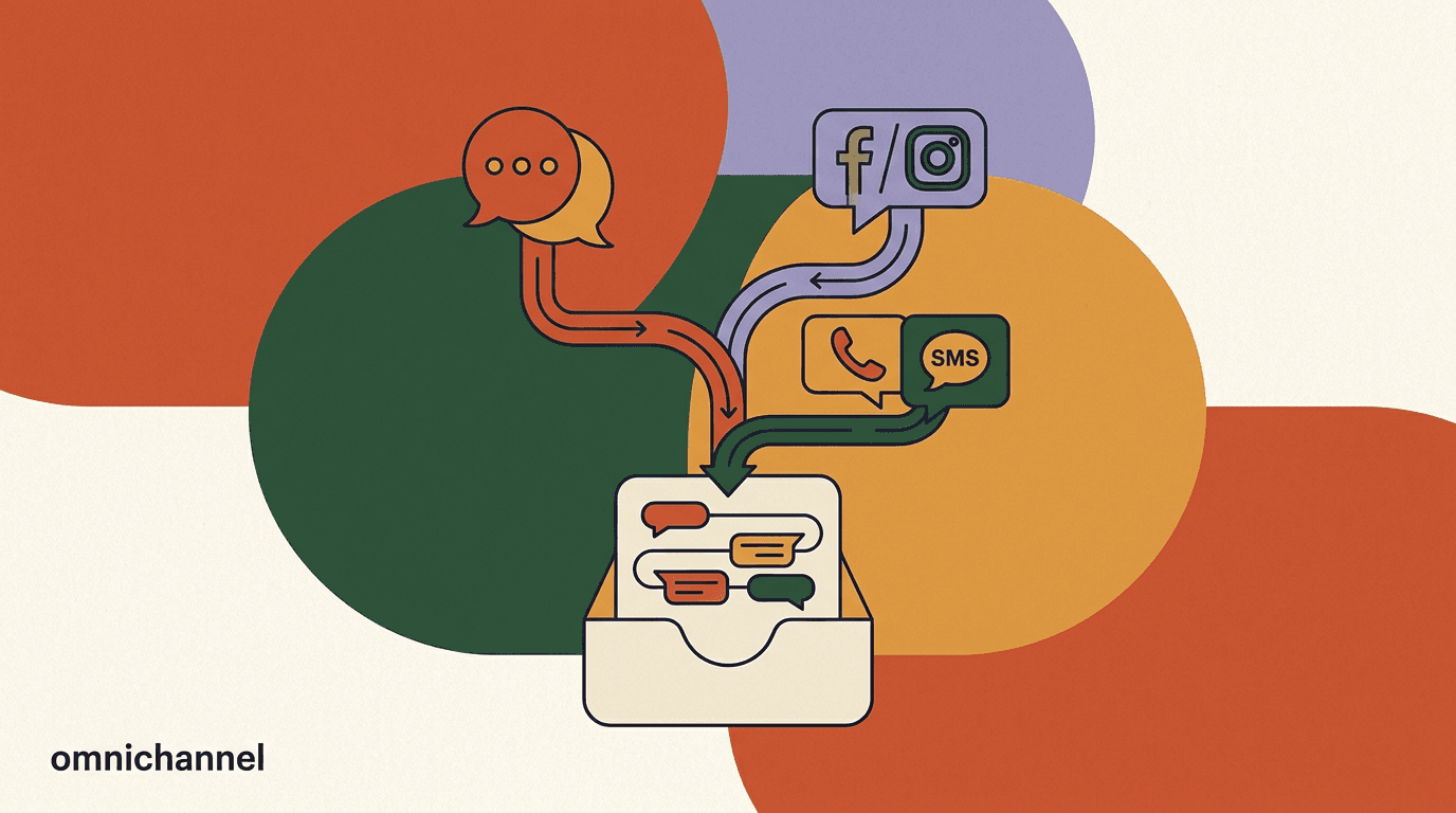
Concretely, that means the capabilities in this article are native, not bolted on. You can assign conversations to teammates, snooze threads until you need them, @mention colleagues, and leave internal notes that the customer never sees. There is an AI co-pilot that drafts and summarizes inside the reply box rather than off in a panel. And the mobile app is built for parity, so the phone is a real workspace, not a viewer. KlyoChat unifies Facebook, Instagram, Telegram, WhatsApp, TikTok, and X into that one inbox.
We should be equally clear about the limits, because a TOF article that only sells is not worth reading. KlyoChat does not do native SMS or email — if those channels are core to your operation, we are not the whole answer and you should factor that in. We are also a newer, smaller product with a smaller community than the incumbents, which means fewer third-party templates and a younger ecosystem. We think the inbox experience is worth it; you should decide that for yourself. Pricing is straightforward: Pro is $49/mo, or $39/mo billed yearly, and there is a 7-day free trial with no credit card so you can test the inbox on your own conversations.
Our bias, stated plainly
We build KlyoChat, so of course we think inbox-first is right. The principles in this piece stand on their own, though — use them to judge any tool, including ours. If a different tool nails assign, snooze, notes, an embedded co-pilot, and mobile parity, that is a good tool.
What inbox-first means in practice
- Assign, snooze, @mention, notes
- Native team features, not add-ons
- AI co-pilot
- Drafts and summarizes inside the reply box
- Mobile
- Full inbox on the phone, built for parity
- Honest limit
- No native SMS or email; smaller community
So what should you do with all of this?
If your current chat tool feels like a chore, it is worth asking whether the problem is you, your process, or the inbox itself. Often it is the inbox — specifically, the assumptions baked into it about who works in it and how. A tool built as a flow engine with a reply box attached will always make the human side of conversations feel like an afterthought, because to that tool, it is one.
The good news is that you now have a checklist. The six capabilities — assign, snooze, @mention, internal notes, an embedded AI co-pilot, and true mobile parity — are not exotic. They are the baseline for treating an inbox like a workspace rather than a message list. Hold any tool you are considering against that list, run the fifteen-minute demo test, and you will quickly see which products take the inbox seriously and which ones treat it as a tab.
It also helps to remember that the inbox is the screen your team will look at more than any other. A flow gets built once and tweaked occasionally. The inbox is open all day, every day, for everyone who touches customer conversations. Small frictions there are not small, because they are paid hundreds of times a week per person. A second saved on every reply, a duplicate avoided on every shared thread, a follow-up that never gets forgotten — those compound into the difference between a team that feels on top of its conversations and one that feels permanently behind.
Whatever you choose, choose with the inbox in mind, not just the flow builder. The flow builder runs while you sleep, and that is great. But the inbox is where the relationship actually happens — where a confused customer becomes a happy one, or does not. That screen deserves to feel like this decade. If you want to see what inbox-first looks like in practice, our take on it is one option to compare against the rest.