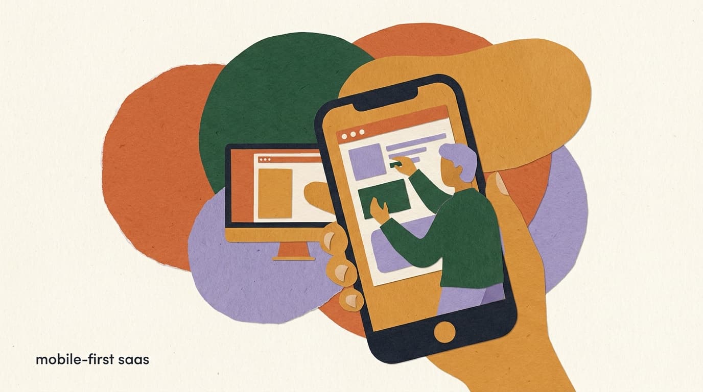
There is a quiet shift happening in how small businesses and creators actually work, and most SaaS companies are pretending it isn't. The person running the show is not at a desk. They are behind a counter, in a car between appointments, on a film set, in a warehouse, or in bed at 11pm catching up on the day. The device in their hand is a phone. The laptop, if it exists at all, is closed.
For years the industry treated mobile as an afterthought — a companion app for checking notifications while the real work happened on desktop. In 2026 that assumption is increasingly wrong for a large and growing slice of the market. The work is happening on the phone. And the products that still treat the phone as a second-class surface are losing customers without ever seeing why.
Full disclosure before we go further: we build KlyoChat, and mobile-first is one of our core pillars, so we have a point of view here. We will keep the product talk to a single short section near the end. The rest of this is an argument about how SaaS should be built in 2026 — one we think holds up whether or not you ever touch our product. We will also be honest about where mobile-first is the wrong call, because pretending it is always right would undercut the whole point.
What does mobile-first SaaS actually mean in 2026?
The phrase gets thrown around loosely, so let's pin it down. Mobile-first SaaS does not mean having a responsive website that reflows on a small screen. It does not mean shipping an app that mirrors your desktop dashboard at a smaller size. And it definitely does not mean a notifications-only companion app that bounces you to a browser the moment you try to do anything real.
Mobile-first means the primary, most common workflow is designed for the phone first, and the desktop version is the adaptation — not the other way around. It is a decision about which surface you optimize for when the two pull in different directions, because they always do. A pricing table that looks great on a 27-inch monitor is unusable as a thumb-driven sheet. A multi-pane workspace that feels powerful on desktop becomes a maze on a 6-inch screen. Mobile-first means you resolve those conflicts in favor of the phone.
The deeper version of the idea is about the job, not the layout. Ask what the customer is most often trying to do, where they are when they do it, and how much time and attention they have. For a huge category of SMB and creator software, the honest answer is: a quick, high-frequency task, done in a spare moment, on a phone, with one hand. If that is the reality, then the product should be built for that reality first.
- Not just responsive: a responsive site is a desktop layout that survives a small screen. Mobile-first is a workflow designed for the small screen from the start.
- Not a companion app: a notifications-only app that kicks you to the browser is desktop-first with a mobile badge.
- Primary workflow on the phone: the most common task should be completable end-to-end on mobile, not just viewable.
- Desktop as the adaptation: when phone and desktop conflict, the phone wins the design decision.
Responsive is the floor, not the ceiling
Almost every modern SaaS is responsive by now — that bar was cleared years ago. Responsive means your product does not break on a phone. Mobile-first means your product is genuinely good on a phone, for the tasks people actually do there. Those are very different claims, and customers can feel the difference within thirty seconds.
Why is the phone becoming the primary work device for SMBs and creators?
This is the structural shift underneath the whole argument, so it is worth slowing down on. A generation of business owners and creators has come up entirely on mobile. Their first computer was a phone. Their instinct, when they need to do something, is to reach for it — not to find a laptop, boot it, and open a tab.
Layer on top of that the nature of the work itself. A creator's entire business often lives inside apps that are mobile-first by design: Instagram, TikTok, and the rest were built for the phone and barely tolerate desktop. If your audience, your content, your DMs, and your analytics all live on the phone, it would be strange to manage the business that wraps around them from a desktop. The tools that win are the ones that meet the work where it already is.
Small business owners follow the same gravity for a different reason: they are mobile because they are not at a desk. The salon owner is between clients. The food truck operator is at the window. The contractor is on a job site. The boutique owner is on the floor. They do not have an office hour to sit and 'do admin' — they do it in fragments, between other things, on the device that is always in their pocket.
Watch where the task happens, not just whether it can
The most useful product research question is not 'can this be done on mobile' but 'where is the customer when they reach for this task, and on what device.' If the honest answer is 'on a phone, in a spare moment,' that is a mobile-first task no matter how your product currently handles it.
A day in the life: where the work actually happens
- 7:40am
- Replies to overnight DMs from bed, on the phone
- 11:15am
- Tweaks an automation between two appointments, in the car
- 2:30pm
- Checks who needs a follow-up while eating lunch standing up
- 9:50pm
- Closes out the day's conversations from the couch, phone in hand
How do desktop-only SaaS tools quietly lose customers?
The damage from a desktop-first product is rarely loud. Customers do not usually file a complaint that says 'your mobile experience is bad.' They just slowly stop using the product, and one day they cancel for a reason that sounds vague — 'didn't get around to it,' 'too much hassle,' 'wasn't sticky for me.' Underneath those soft reasons is often a hard one: the product demanded a laptop the customer rarely opened.
The failure mode is friction at the exact moment the customer wants to act. They get a notification that a high-value lead just messaged. They tap it. The app shows them the message but greys out the one thing they want to do — edit the automation, change a setting, send a considered reply with a template — and tells them, in effect, to go find a computer. That moment is where retention dies. The intent was there; the product could not catch it.
Multiply that across every spare moment in a week and you get a product that is technically subscribed-to but functionally unused. And unused products churn. The customer is not angry. They simply never built the habit, because the habit required a device and a sit-down session they could not consistently give.
- Silent churn: customers leave citing vague reasons that mask a real one — the product needed a laptop they rarely opened.
- Friction at the moment of intent: the notification arrives, the customer taps, and the action they want is desktop-only. The intent evaporates.
- No habit forms: high-frequency tools live or die on habit, and habit needs the device that is always present.
- Lost in evaluation: a phone-first buyer who trials your tool on their phone may decide in the first session, before you ever earn a desktop visit.
The trial is often decided on a phone
If your buyer is mobile-first, your free trial is frequently evaluated on a phone first. A clunky mobile onboarding can lose the deal before the customer ever sees the polished desktop experience you were counting on. The mobile path is not the consolation prize — for many buyers it is the first impression.
What's the real difference between desktop-first and mobile-first SaaS?
It helps to see the two philosophies side by side, because the differences run deeper than screen size. They show up in what gets built, what gets cut, and what the customer can actually accomplish in a given moment.
| Dimension | Desktop-first SaaS | Mobile-first SaaS |
|---|---|---|
| Primary surface | Desktop dashboard; mobile is a shrunken copy | Phone workflow; desktop is the adaptation |
| Core task on phone | Often view-only or blocked | Completable end-to-end |
| Mobile app role | Notifications and light viewing | Full operating surface |
| Design tie-breaker | Big screen wins conflicts | Small screen wins conflicts |
| Where work happens | At a desk, in sessions | Anywhere, in fragments |
Same feature, two philosophies
- Desktop-first 'edit automation'
- View the flow on mobile; tap edit and get 'please use a desktop browser'
- Mobile-first 'edit automation'
- Open, change a trigger, save, and publish — all from the phone in under a minute
Isn't a responsive website enough? Why build for mobile-first at all?
This is the most common objection, and it deserves a fair answer rather than a dismissal. Responsive design is a genuine achievement and, for some products, it is genuinely enough. A reporting tool that someone checks once a week, a billing console an accountant opens monthly, an admin panel used during a planned work session — these can live happily as responsive desktop apps. The task is infrequent and intentional, so asking the user to sit down for it is reasonable.
The argument for going further than responsive kicks in when the task is frequent, time-sensitive, and done on the move. Responsive design solves layout: it makes sure nothing overflows the screen. It does not solve interaction or intent. A form with twelve fields is responsive when it stacks neatly on a phone — and still miserable to fill out with a thumb on a bus. Mobile-first is the discipline of asking whether that form should have twelve fields at all on mobile, or whether the phone version should do something smaller and smarter.
So the honest position is not 'responsive is bad.' It is 'responsive is the right ceiling for low-frequency, deliberate tasks, and the wrong ceiling for high-frequency, in-the-moment ones.' The mistake desktop-first companies make is assuming their product is in the first category when their customers are living in the second.
Frequency is the deciding variable
A rough rule: the more often a task is done, and the more often it is done away from a desk, the more it deserves a true mobile-first treatment rather than a responsive fallback. Low-frequency, deliberate work can stay responsive. High-frequency, in-the-moment work cannot, or it will quietly bleed users.
What does a genuinely mobile-first workflow look like in practice?
Abstract principles are easy to nod along to and hard to apply, so here is what mobile-first actually changes about how a feature is built. The test for each of these is simple: can the customer finish the job on a phone, with one hand, in a spare moment, without wishing they had a laptop?
- Start from the most common task, not the feature listIdentify the one or two things customers do many times a day and design those for the phone first. Everything else adapts around them. If your most frequent task is desktop-only, you are desktop-first no matter what your app store listing says.
- Make actions completable, not just viewableViewing a notification is table stakes. The mobile-first bar is acting on it — replying, editing, approving, publishing — without being bounced to a browser. If a tap leads to a dead end, that is the gap to close.
- Design for thumbs and fragments of attentionOne-handed reach, large tap targets, short flows, and sensible defaults so a task can be finished in the gap between two other things. Assume the customer has thirty seconds and one hand, not ten minutes and a mouse.
- Cut, don't shrinkA mobile-first feature is often a smaller, sharper version of the desktop one, not a miniaturized copy of everything. Decide what the phone version does superbly and leave the rest to desktop on purpose.
- Respect the device's strengthsPush notifications, the camera, offline tolerance, and quick voice or photo input are native advantages. A mobile-first product uses them rather than ignoring them in favor of a literal port of the web app.
Mobile-first vs ported-to-mobile, same notification
- Ported-to-mobile
- Notification opens a read-only view; the reply button opens a browser tab
- Mobile-first
- Notification opens the conversation; reply, apply a template, and update a tag inline, then done
How do you tell if a SaaS product is truly mobile-first or just claims to be?
Marketing pages love the phrase 'mobile-first,' so as a buyer you need a way to test the claim rather than take it at face value. The good news is that you can usually find out in one trial session on your phone. Try to do your actual most-common task — not a demo, your real workflow — entirely on mobile, and watch where it breaks.
The tells are consistent. A truly mobile-first product lets you complete the core job end-to-end on the phone and feels designed for it, not merely tolerant of it. A pretender lets you look but not touch: you can view dashboards, read messages, and admire charts, but the moment you try to create, edit, or configure, it nudges you toward a desktop.
- Can you complete your single most-common task entirely on the phone, including the part that changes data?
- Does the app ever say 'please use a desktop browser' for something you would realistically need on the go?
- Does setup and onboarding work on mobile, or does it assume you are at a computer?
- Do the core actions feel thumb-friendly, or do they feel like a desktop UI squeezed onto glass?
- Are notifications actionable in place, or do they merely alert you and then strand you?
Run the one-thumb test during your trial
Pick the task you will do most often. Put the laptop away. Try to complete it on your phone, one-handed, as if you were waiting in a line. If you can finish it without frustration, the product is mobile-first for your use case. If you hit a wall, you have your answer before you ever paid.
What are the honest trade-offs of building mobile-first?
If this essay only argued that mobile-first is better, it would be propaganda. Mobile-first is a set of trade-offs, and pretending otherwise does no one any favors. There are real things you give up, and some categories of work where the phone is simply the wrong tool. A fair argument names both.
The screen is small, and there is no getting around it. Some tasks genuinely benefit from a large canvas: designing a complex multi-step automation with branching logic, comparing many records at once, doing dense data analysis, or writing long-form content. Forcing those onto a phone in the name of purity makes the product worse, not better. Mobile-first done well knows which tasks belong on desktop and does not pretend otherwise.
There is also a build cost. Doing mobile-first properly often means designing twice — once for the phone and once for the desktop adaptation — rather than building one layout and letting it reflow. That is more design work, more engineering, and more surface area to test. It is a deliberate investment, and a team that is not willing to make it should not claim the label.
| Trade-off | What you gain | What you give up |
|---|---|---|
| Small screen focus | Speed and reach in the moment | Canvas for dense, complex tasks |
| Cut, don't shrink | A sharp, finishable mobile flow | Feature parity on every surface |
| Designing twice | Genuinely good on both devices | More design, build, and test cost |
| Phone-first defaults | Frictionless high-frequency work | Some power-user depth moves to desktop |
Mobile-first is not mobile-only
The goal is not to delete the desktop. Power-user tasks — heavy configuration, bulk operations, deep analysis — are often better on a big screen, and a serious mobile-first product still offers a strong desktop experience for them. Mobile-first decides the tie-breaker; it does not abolish the other surface.
Which tasks belong on the phone, and which belong on desktop?
Because mobile-first is not mobile-only, the practical skill is deciding which jobs go where. This is not guesswork; it follows from frequency, urgency, and complexity. A task that is frequent, urgent, and simple wants the phone. A task that is rare, deliberate, and complex wants the desktop. Most products have a mix, and the design job is to route each one to its right home.
Getting this routing right is what separates a thoughtful mobile-first product from a dogmatic one. The dogmatic version crams a branching-logic builder onto a phone to prove a point and produces something nobody enjoys using. The thoughtful version puts the daily inbox and quick edits on the phone, keeps the deep configuration comfortable on desktop, and makes sure the handoff between them is smooth.
- Frequent + urgent + simple → phone. These are the tasks that define whether the product is part of someone's day.
- Rare + deliberate + complex → desktop. Forcing these onto mobile is purity for its own sake.
- Smooth handoff → both. Start something on the phone, finish it on desktop, and never lose your place.
Routing tasks by their nature
- Reply to a customer DM
- Phone — frequent, urgent, simple
- Toggle an automation on or off
- Phone — quick, in-the-moment
- Build a complex branching flow from scratch
- Desktop — rare, deliberate, complex
- Run a daily inbox sweep
- Phone — high-frequency, done anywhere
- Bulk-edit hundreds of records
- Desktop — wide canvas helps
Why does mobile-first matter more in 2026 than it did five years ago?
Two things changed. First, the composition of the buyer base shifted. The creator economy and the long tail of solo and micro businesses grew into a serious software market, and those buyers are mobile-native to a degree the previous generation of SMB software was not built for. The customer changed faster than most products did.
Second, AI moved the bottleneck. For a long time, a lot of business software was about manual input — typing, configuring, dragging things around — which genuinely is easier on a desktop. As AI takes over more of the drafting, sorting, and first-pass work, the human's job shifts toward quick review and approval: reading a suggested reply and sending it, glancing at a summary and acting on it, confirming or correcting a decision. Review-and-approve is a perfect phone task. It is short, it is frequent, and it does not need a keyboard. AI did not just add features; it changed the shape of the work toward exactly the kind of thing the phone is best at.
Put those together and the case for mobile-first is stronger now than it has ever been. The buyers are more mobile, and the work itself — increasingly mediated by AI — is more suited to the phone. A product designed around a desk in 2020 may be fighting both trends at once.
AI and mobile reinforce each other
As AI shoulders more of the heavy input, the human's role tilts toward fast review and approval — short, frequent decisions that fit a phone perfectly. The rise of AI in SaaS quietly strengthens the case for mobile-first rather than competing with it.
How should a SaaS team decide whether to go mobile-first?
If you build software, the question is not whether mobile-first is good in the abstract — it is whether it is right for your product and your customer. Here is a practical way to decide, honestly, without forcing the answer in either direction.
- Map your customer's real dayWhere are they when they reach for your product, and on what device? If the honest answer is 'a phone, in spare moments,' that points one way. If it is 'a desk, in a planned session,' it points the other.
- Rank your tasks by frequency and urgencyList what customers do, how often, and how time-sensitive each is. The high-frequency, high-urgency tasks are your mobile-first candidates. The rare, deliberate ones can stay desktop-strong.
- Pressure-test the most common task on a phoneTry to complete it on mobile today. Where it breaks is your roadmap. If it cannot be finished on a phone and your customers are mobile, that gap is costing you retention right now.
- Decide your tie-breaker rule, and write it downWhen phone and desktop conflict, which wins? Mobile-first means committing to the phone as the default winner for your core flow. Make it an explicit principle so it survives the next feature debate.
- Be willing to cut, and to investMobile-first means a sharper, smaller mobile flow and the cost of designing twice. If you are not willing to do both, do not claim the label — a half-built mobile experience is worse than an honest desktop-first one.
Let the customer's device decide, not the team's
Software teams build on big monitors all day, which biases them toward desktop-first instinctively. The customer's reality is the only vote that counts. If they live on a phone and you live on a 27-inch display, trust their context over your own.
What can SaaS learn from how consumer apps treat the phone?
There is a strange gap between consumer software and business software when it comes to the phone, and closing it is a large part of what mobile-first means in 2026. Consumer apps treat the phone as the product, full stop. The people building business tools grew up using those same consumer apps and expect that level of fluidity in their personal lives — then tolerate something far clunkier at work because 'that is just how business software is.' The expectation gap is the opportunity.
Look at what the best consumer apps assume. They assume you have a few seconds, not a few minutes. They assume one hand. They assume interruptions — that you will be pulled away mid-action and need to resume without losing your place. They assume notifications are doorways into real actions, not just alerts. They assume the camera and the microphone are first-class inputs, not afterthoughts. None of that is exotic; it is simply taking the device seriously. Business software that imports even a fraction of those assumptions feels dramatically better than its peers, because the bar in the category is still so low.
The lesson is not that business tools should become trivial or game-like. It is that the patience a customer extends to a tool is set by the best apps they use, not by other business software. A creator who can edit a video, schedule a post, and reply to a hundred comments from their phone in consumer apps will not happily switch to a laptop to run the business layer that sits on top of those same activities. Their standard was set elsewhere, and the SaaS that meets it wins by comparison.
- Assume seconds and one hand, the way the best consumer apps do, rather than a planned desk session.
- Treat interruptions as normal: let people leave a task mid-flow and resume without losing their place.
- Make notifications doorways into action, not dead-end alerts.
- Treat the camera, microphone, and quick inputs as first-class, not bolt-ons.
- Remember that customers' patience is set by the best apps they use, not by your competitors.
The bar is set outside your category
Your customers judge your mobile experience against the consumer apps they use every day, not against other business software. That is intimidating, but it is also the opening: most business tools have not even tried to meet that bar, so the ones that do stand out immediately.
What does silent mobile churn actually cost a SaaS business?
It is worth dwelling on the economics, because the cost of a desktop-first stance is easy to underestimate precisely because it is invisible. A loud problem — an outage, a billing bug, a broken feature — generates tickets, and tickets get fixed. A silent problem generates nothing. The customer who could not finish a task on their phone does not write in. They simply drift, and the drift never shows up as a complaint you can act on.
Consider the shape of the loss. For a high-frequency tool, retention compounds: a customer who completes their core task every day is far stickier than one who manages it twice a week when they happen to be at a laptop. The daily-habit customer renews almost automatically; the twice-a-week customer is one busy month away from forgetting the product exists. The difference between those two customers is often nothing more than whether the core task was finishable on a phone. Same product, same features, completely different lifetime value — decided by a design philosophy.
Then there is acquisition waste. If your buyer is mobile-native and your trial breaks on a phone, you are paying to acquire trials that fail in the first session, before your best work — the polished desktop flow — is ever seen. You are effectively spending marketing budget to demonstrate the weakest version of your product to exactly the people most likely to judge it there. That is not a small leak; for a phone-first audience it can be the dominant one.
Silent churn does not leave a paper trail
Because mobile friction produces drift rather than complaints, it is one of the hardest retention problems to diagnose from inside the company. Exit surveys say 'too busy' or 'didn't use it enough,' which sounds like the customer's fault. Often it is a product that could not fit into a phone-shaped life.
Two customers, same product, different surfaces
- Desktop-bound customer
- Opens the laptop twice a week, finishes the task in batches, renews on autopilot but at risk every busy month
- Phone-enabled customer
- Completes the core task daily in spare moments, builds a habit, renews because the product is woven into the day
How does mobile-first change onboarding and the first session?
Onboarding is where the mobile-first decision pays off or fails first, and it is the part teams most often forget. A desktop-first company designs its onboarding for a person sitting at a computer with time and a keyboard: long forms, multi-step setup wizards, copy-paste of API keys, and a tour that assumes a wide screen. Hand that same flow to a phone-first buyer in a spare moment and it collapses. They cannot copy-paste from another tab as easily, they will not type long answers with a thumb, and they do not have the uninterrupted ten minutes the wizard assumes.
Mobile-first onboarding inverts the assumptions. It gets the customer to a first meaningful action fast — connect one channel, send one message, see one result — and defers the heavy configuration to later, optionally to desktop, once the value is already obvious. The goal of the first session on a phone is not completeness; it is a single moment of 'oh, this works.' Everything else can wait, because a customer who has felt the product work will come back to finish setup. A customer who hit a wall in the first three minutes will not.
This is also where the device's native strengths matter most. Signing in with a tap, granting permissions inline, connecting an account through an app handoff rather than copying credentials — these are mobile-native paths that a desktop-ported onboarding ignores. A product that uses them feels like it belongs on the phone. One that makes you find a laptop to finish signup has already told the customer where it really lives.
- Reach a first result before asking for setupGet the customer to one visible win — a connected channel, a sent reply, a working automation — before any long configuration. Value first, depth later.
- Defer heavy configuration, don't demand itComplex setup can wait, and can live on desktop. Forcing it into the first mobile session is the fastest way to lose a phone-first trial.
- Use native sign-in and account handoffsTap-to-authenticate and in-app permission grants beat copy-pasting keys from another tab. Lean on what the phone does well.
- Keep the first session finishable in minutesAssume a few interrupted minutes, not an uninterrupted hour. If the first session needs a desk, your onboarding is desktop-first regardless of the label.
The first session is the whole ballgame for mobile trials
Phone-first buyers decide fast and in fragments. If they cannot reach a single 'this works' moment in their first few interrupted minutes, the trial is usually over — no matter how strong the product becomes once fully set up.
All of which leads to the practical question every reader of this piece eventually asks: where does any of this leave the tools I actually use, or build? Before we close, a brief and deliberately contained word on how we try to live the argument ourselves.
A quick word on where KlyoChat fits
We have kept the product out of this on purpose, because the argument stands on its own. But since mobile-first is one of our core pillars, here is the short, honest version of how we apply everything above — one mention, then back to the ideas.
KlyoChat is an AI-native, mobile-first unified inbox for Facebook, Instagram, Telegram, WhatsApp, TikTok, and X. The thing we cared most about is that you can build and edit your automations and run the entire inbox from your phone — not just get notified, but actually do the work: reply, apply templates, edit a flow, change a setting, all from the device that is already in your hand. The deep, complex configuration is comfortable on desktop too, because mobile-first is not mobile-only. Pricing is straightforward: Pro is $49 per month, or $39 if you pay yearly, and there is a 7-day free trial with no credit card so you can run the one-thumb test on your own real workflow.
We will be equally honest about the limits, because that is the only way this is worth reading. KlyoChat does not do native SMS or email — if those channels are core to you, factor that in. We are a newer product with a smaller community than the long-established incumbents, so the template marketplace and the years of community answers are not as deep yet. And mobile-first is a trade-off for us too: some genuine power-user tasks are still better on a big screen, and we would rather say so than pretend the phone is always the right place for everything.
Try the test, not the pitch
The best way to judge any mobile-first claim — ours included — is the one-thumb test from earlier. Put the laptop away, open the trial on your phone, and try to run your real workflow. If it works, the claim is real. If it does not, no marketing page should change your mind.
What's the takeaway for buyers and builders?
For buyers: stop evaluating SaaS only at your desk if you do not live at your desk. Trial the product where you will actually use it — on your phone, in a spare moment — and judge it on whether your most common task is finishable there. A beautiful desktop dashboard is cold comfort if you only open your laptop twice a week.
For builders: mobile-first is not a coat of paint, and it is not free. It is a decision about whose context wins when the screens disagree, and it costs real design and engineering effort to honor. But for a growing share of the market — creators, solo operators, and small teams who run their business from a phone — it is increasingly the difference between a product that becomes a daily habit and one that quietly churns.
And for everyone: be honest about the trade-offs. Mobile-first is the right call for frequent, urgent, in-the-moment work, and the wrong call for rare, deliberate, complex work that wants a wide canvas. The skill is not picking a side forever; it is routing each task to the device where it belongs, and committing to the phone as the default for the work your customers actually do every day.